Content Menu
● Introduction
● Importance of Font Choice
● Types of Fonts
>> Serif Fonts
>> Sans-Serif Fonts
>> Script and Display Fonts
● Best Fonts for Business Cards
>> Additional Considerations When Choosing Fonts
● Tips for Choosing the Right Font
● Designing Your Business Card
>> Layout
>> Color Scheme
>> Material Choices
● Conclusion
● Related Questions
>> 1. What is the best font size for business cards?
>> 2. Can I use multiple fonts on my business card?
>> 3. Are script fonts suitable for business cards?
>> 4. How do I ensure my business card stands out?
>> 5. Should I consider printing samples before finalizing my design?
● Citations:
Introduction
Business cards remain an essential tool for professionals to network and establish connections. Despite the digital age, a well-designed business card can leave a lasting impression. One of the most critical aspects of business card design is the choice of font. The right font not only conveys professionalism but also reflects the brand's identity. This article explores the best fonts for business cards, their characteristics, and how to choose the right one for your needs.

Importance of Font Choice
Choosing the right font for a business card is crucial due to several factors:
- Legibility: Business cards are small, typically measuring 3.5 x 2 inches. A legible font ensures that the information is easily readable at a glance.
- Brand Identity: The font can communicate the brand's personality. For instance, a modern sans-serif font may convey innovation, while a classic serif font may suggest tradition and reliability.
- Visual Hierarchy: The choice of font affects how information is prioritized on the card. Different fonts can create a visual hierarchy that guides the reader's eye to the most important details.
- First Impressions: A well-chosen font can make a strong first impression. It sets the tone for your brand and can influence how potential clients or partners perceive you.
Types of Fonts
Fonts can be broadly categorized into two main types: serif and sans-serif.
Serif Fonts
Serif fonts have small decorative strokes at the ends of their letters. They are often associated with tradition and reliability. Common serif fonts suitable for business cards include:
- Times New Roman: A classic choice known for its readability and professionalism. It is often used in formal documents and academic settings.
- Garamond: Offers elegance with its old-style serifs, making it suitable for creative professions such as design or writing.
- Baskerville: Known for its high contrast and crisp edges, it adds sophistication to any card, making it ideal for law firms or consulting agencies.
Sans-Serif Fonts
Sans-serif fonts lack the decorative strokes found in serif fonts. They are perceived as modern and clean, making them popular choices for business cards. Notable sans-serif fonts include:
- Helvetica: Renowned for its clarity and neutrality, making it versatile across various industries from tech startups to corporate businesses.
- Arial: A widely used alternative to Helvetica, known for its simplicity and legibility. It is often used in digital formats as well.
- Futura: A geometric sans-serif that provides a modern look, ideal for creative fields such as advertising or graphic design.
Script and Display Fonts
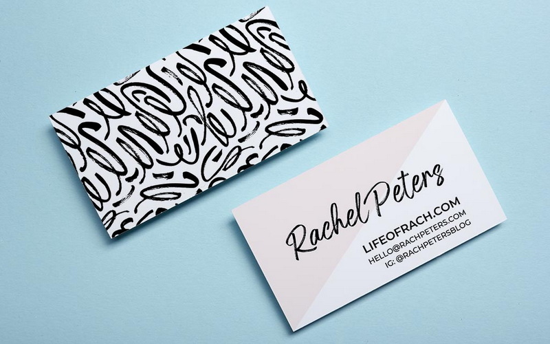
Script fonts mimic handwriting and can add a personal touch to business cards. However, they should be used sparingly to maintain readability. Display fonts are decorative and can be used for specific elements like logos or headings but may not be suitable for body text.
Best Fonts for Business Cards
Based on various sources and expert opinions, here are some of the best fonts for business cards:
| Font Name | Type | Characteristics |
| Times New Roman | Serif | Classic, professional, highly readable |
| Helvetica | Sans-Serif | Clean, modern, versatile |
| Arial | Sans-Serif | Simple, legible, widely recognized |
| Futura | Sans-Serif | Geometric shapes, contemporary |
| Garamond | Serif | Elegant, traditional |
| Baskerville | Serif | High contrast, sophisticated |
| Playfair Display | Serif | Minimalistic yet regal |
| Avenir | Sans-Serif | Modern with a touch of elegance |
| Roboto | Sans-Serif | Friendly appearance with excellent legibility |
| Scriptina | Script | Flowing script style; should be used sparingly |
Additional Considerations When Choosing Fonts
1. Cultural Relevance: Different cultures may have varying associations with specific fonts. For example, while Helvetica may be seen as modern in Western cultures, it might not carry the same connotation in others. Research your target audience's cultural context when selecting your font.
2. Industry Standards: Certain industries have established norms regarding font usage. For instance, legal firms often opt for traditional serif fonts to convey trustworthiness, while tech companies might prefer sleek sans-serif fonts that suggest innovation.
3. Color Compatibility: The color of your text should complement your chosen font. Light-colored text on a dark background or vice versa can enhance readability but requires careful selection of both color and font weight.
4. Font Pairing: If you decide to use more than one font on your business card (for example, one for your name and another for contact details), ensure they complement each other well. Contrast is key; pairing a bold sans-serif with a light serif can create an appealing visual balance.
5. Brand Consistency: Ensure that your font choice aligns with your overall branding strategy. If you have an established logo or website with specific typography, using similar fonts on your business card will reinforce brand recognition.

Tips for Choosing the Right Font
1. Consider Your Brand Identity: Choose a font that aligns with your brand's personality—modern vs. traditional.
2. Ensure Legibility: Opt for fonts that are easy to read at small sizes. Avoid overly decorative fonts that may hinder readability.
3. Limit Font Variety: Use no more than two different fonts on your business card to maintain cohesion and clarity.
4. Test Print Samples: Before finalizing your design, print samples to see how the font looks on paper and ensure it meets your expectations.
5. Use Appropriate Sizes: Stick to standard font sizes (10-11 pt) for body text while using larger sizes (12-14 pt) for names or titles to create emphasis.
6. Seek Feedback: Once you've narrowed down your choices, seek feedback from peers or colleagues about which fonts resonate best with them regarding professionalism and attractiveness.
7. Stay Updated with Trends: While timeless designs are essential, being aware of current typography trends can help you make informed decisions that keep your brand relevant in a fast-paced market.
Designing Your Business Card
Once you've selected the appropriate font(s), it's time to consider other design elements that will enhance your business card:
Layout
The layout should be clean and organized to ensure all information is easily accessible:
- Hierarchy of Information: Your name should be prominent; consider using larger font sizes or bolding it.
- Contact Details Arrangement: Organize contact details logically—usually starting with phone numbers followed by email addresses and social media links if applicable.
- Whitespace Utilization: Don't overcrowd your card; ample whitespace helps guide the reader's eye through the information without feeling overwhelmed.
Color Scheme
The color scheme should align with both your brand identity and enhance readability:
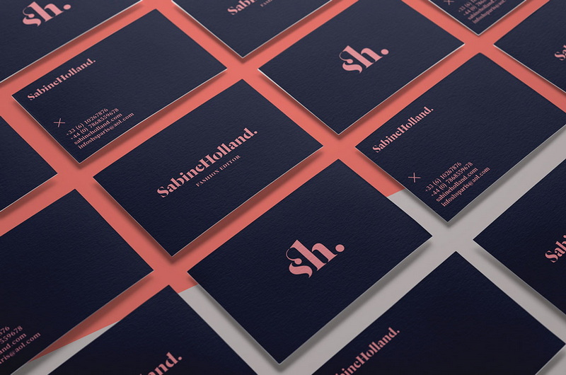
- Contrast Matters: Ensure there is enough contrast between text color and background color so that all information stands out clearly.
- Brand Colors: Incorporate brand colors into your design but avoid using too many colors that could distract from essential information.
Material Choices
The material of your business card also plays a role in its overall impact:
- Cardstock Quality: Thicker cardstock conveys quality; consider options like matte or glossy finishes based on what fits best with your brand image.
- Special Finishes: Embossing or foil stamping can add an extra touch of elegance but should be used judiciously to avoid overwhelming the design.
Conclusion
Selecting the best font for your business card is an essential aspect of effective design that can significantly impact how you are perceived by potential clients or partners. By understanding the characteristics of different font types—serif, sans-serif, script—and considering factors such as legibility and brand identity, you can make an informed decision that enhances your professional image.
In summary, whether you opt for a classic serif like Times New Roman or a modern sans-serif like Helvetica, ensure that your choice aligns with your brand's message and is easy to read at a glance. Remember that every element—from layout to color scheme—works together harmoniously to create an impactful first impression through your business card design.

Related Questions
1. What is the best font size for business cards?
The typical font size for body text on business cards is between 10-11 pt. For names or titles, larger sizes (12-14 pt) are recommended to create emphasis while maintaining readability.
2. Can I use multiple fonts on my business card?
Yes, but it's advisable to limit yourself to two different fonts to maintain visual cohesion and clarity in your design.
3. Are script fonts suitable for business cards?
Script fonts can add a personal touch but should be used sparingly as they may affect readability if overused.
4. How do I ensure my business card stands out?
Choose unique yet legible fonts that reflect your brand identity while ensuring good contrast between text and background colors.
5. Should I consider printing samples before finalizing my design?
Yes, printing samples allows you to see how your chosen font looks on paper and helps ensure it meets your expectations in terms of readability and aesthetics.
Citations:
1. https://www.manypixels.co/blog/brand-design/best-fonts-for-business-cards
2. https://www.printivity.com/insights/2020/09/14/best-font-for-business-cards/
3. https://www.moo.com/blog/inspiration/10-inspirational-fonts-for-printing-business-cards
4. https://www.banana-print.co.uk/blog/best-business-card-fonts/
5. https://www.reddit.com/user/aladdinprint-shop/comments/pstc0t/business_cards_how_to_pick_the_right_font_size/
6. https://www.4over4.com/content-hub/stories/10-best-fonts-for-business-cards-to-create-a-lasting-impact
7. https://www.reddit.com/r/graphic_design/comments/5uqykt/what_is_your_favorite_font_for_your_business_card/
8. https://www.cnblogs.com/apachecn/p/18462329


