Content Menu
● Importance of Proper Formatting
● Choosing the Right Format
● Placement on the Card
● Icons and Visual Elements
● Font Size and Style
● Including Additional Contact Methods
● Common Mistakes to Avoid
● The Role of Color in Business Cards
● The Impact of Material and Texture
● Digital Business Cards
● Conclusion
● Related Questions
>> 1. What is the best way to format an international phone number on a business card?
>> 2. Should I include both mobile and landline numbers on my business card?
>> 3. How can I make my phone number stand out on my business card?
>> 4. What font size is recommended for contact information on business cards?
>> 5. Is it necessary to include an email address along with my phone number?
● Citations:
Creating a business card is a vital step in establishing your professional identity. One of the most important elements of a business card is the phone number, as it serves as a primary means of communication between you and potential clients or partners. This article will explore the best practices for writing phone numbers on business cards, ensuring clarity, professionalism, and effectiveness.

Importance of Proper Formatting
Proper formatting of phone numbers on business cards is crucial for several reasons:
- Clarity: A well-formatted phone number is easier to read and understand, reducing the chances of miscommunication.
- Professionalism: A neat presentation reflects positively on your brand and can create a good first impression.
- Accessibility: Including the correct format ensures that clients can easily reach you without confusion.
Choosing the Right Format
When it comes to formatting your phone number, consider the following guidelines:
- Use International Standards: Start with the sign followed by your country code. For example, for a US number, write it as +1 (123) 456-7890.
- Area Codes: Use parentheses for area codes. For instance, (123) 456-7890 is clear and professional.
- Separation of Digits: Separate groups of digits with spaces or dashes to enhance readability. For example, 123-456-7890 or 123 456 7890 are both acceptable formats.
- Labeling Numbers: If you have multiple contact numbers (e.g., mobile and landline), label them clearly. For example:
- Mobile: +1 (123) 456-7890
- Office: +1 (098) 765-4321
Placement on the Card
The placement of your phone number on the business card is just as important as its format:
- Prominent Positioning: Place your phone number near your name or logo to ensure it catches the eye of potential clients.
- Avoid Clutter: Ensure that the card does not look overcrowded. Leave enough white space around your contact information for better visibility.
Icons and Visual Elements
Incorporating visual elements can enhance the appeal and readability of your business card:
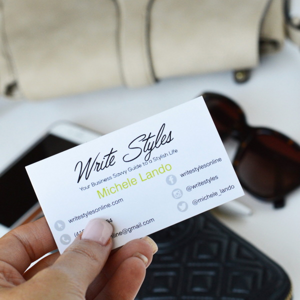
- Use Icons: Adding a small phone icon next to your number can help draw attention to it.
- Consistent Design: Ensure that any icons used match the overall design theme of your card for a cohesive look.
Font Size and Style
The choice of font plays a significant role in readability:
- Legible Font Size: Use a font size between 8 and 12 points for clarity. Avoid overly decorative fonts that may hinder readability.
- Consistent Font Style: Keep font styles consistent throughout the card to maintain professionalism.
Including Additional Contact Methods
While it's essential to include your phone number, consider adding other contact methods as well:
- Email Address: Including an email address provides an alternative way for clients to reach you.
- Social Media Handles: If relevant, include links to professional social media profiles like LinkedIn or Instagram, especially if these platforms are integral to your business operations.

Common Mistakes to Avoid
To ensure your business card is effective, avoid these common pitfalls:
- Incorrect Formatting: Double-check that your phone number follows the recommended format before printing.
- Overcrowding Information: Avoid cramming too much information onto the card; prioritize essential details only.
- Neglecting Proofreading: Always proofread your card for typos or errors in contact information.
The Role of Color in Business Cards
Color can significantly affect how information is perceived on a business card:
- Contrast for Readability: Ensure that there is enough contrast between the background color and text color so that your phone number stands out clearly.
- Brand Colors: Use colors that align with your brand identity while maintaining professionalism. Consistency in color usage helps reinforce brand recognition.
The Impact of Material and Texture
The material and texture of your business card can also influence how contact information is perceived:
- Quality Paper Stock: Using high-quality paper stock can convey professionalism and attention to detail.
- Textured Finishes: Consider using textured finishes that can make tactile impressions memorable, but ensure they do not interfere with legibility.
Digital Business Cards
In today's digital age, consider creating digital versions of your business cards:
- QR Codes: Incorporate QR codes that link directly to your website or digital portfolio. This allows potential clients to access more information quickly without having to remember or write down details.
- Mobile Compatibility: Ensure that any digital format you use is compatible with various devices and platforms so that clients can easily save or access your information.
Conclusion
In summary, writing phone numbers on business cards requires careful consideration of formatting, placement, design elements, color choices, material quality, and even digital adaptations. By following best practices such as using international standards, labeling numbers clearly, ensuring readability through appropriate font choices, and considering additional contact methods, you can create an effective business card that enhances communication with potential clients. A well-designed card not only facilitates easy contact but also leaves a lasting impression in a competitive professional landscape.

Related Questions
1. What is the best way to format an international phone number on a business card?
The best way is to start with a sign followed by the country code (e.g., +1 for the USA), then include the area code in parentheses and separate groups of digits with spaces or dashes.
2. Should I include both mobile and landline numbers on my business card?
Yes, if you have both types of numbers, include them with clear labels (e.g., Mobile or Office) to provide options for clients to reach you.
3. How can I make my phone number stand out on my business card?
You can use icons next to your phone number and place it prominently near your name or logo while ensuring enough white space around it for visibility.
4. What font size is recommended for contact information on business cards?
A font size between 8 and 12 points is generally recommended for clarity and professionalism.
5. Is it necessary to include an email address along with my phone number?
While not mandatory, including an email address provides an alternative means of communication and can be beneficial for clients who prefer written correspondence.
Citations:
1. https://www.youtube.com/watch?v=BjvSPGSC3HQ
2. https://www.4over4.com/content-hub/stories/proper-business-card-format-tips-on-formatting-your-cards
3. https://github.com/jueqingsizhe66/XEmacs.d/blob/develop/README.md
4. https://www.spaceprint.com.au/how-to-display-mobile-number-on-a-business-card/
5. https://www.reddit.com/r/graphic_design/comments/4bhh8w/what_is_your_preferred_method_of_representing/
6. http://www.meripet.com/Oqush/applyingguide2007.pdf
7. https://www.prinux.com/en/telephone-numbers-on-business-cards-legible-or-conform-to-standards/
8. https://www.cnblogs.com/apachecn/p/18500101
9. https://lifeyourway.net/how-to-display-a-phone-number-on-a-business-card/
10. https://www.pistonheads.com/gassing/topic.asp?h=0&f=92&t=1385760


