Content Menu
● Introduction
● Understanding the Purpose of Business Cards
● Key Elements of a Professional Business Card
>> Size and Shape
>> Layout
>> Typography
>> Color Scheme
>> Logo Inclusion
>> Contact Information
>> Additional Features
● Materials and Printing Options
>> Cardstock Quality
>> Printing Techniques
● Designing Your Business Card
>> Concept Development
>> Using Design Software
● Finalizing Your Business Card Design
>> Proofreading
>> Feedback
>> Printing Options Comparison
● Common Pitfalls to Avoid
● The Digital Business Card: A Modern Alternative
● Conclusion
● Frequently Asked Questions (FAQs)
>> 1. What size should my business card be?
>> 2. How many colors should I use on my business card?
>> 3. Should I include my photo on my business card?
>> 4. What type of paper is best for business cards?
>> 5. How often should I update my business cards?
● Citations:
Introduction
Creating professional business cards is a vital aspect of establishing and promoting your personal brand or business. A well-designed business card not only conveys essential information but also leaves a lasting impression on potential clients and partners. In this comprehensive guide, we will explore the various elements involved in designing effective business cards, including layout, typography, color schemes, materials, and innovative features. By the end of this article, you will have a clear understanding of how to create business cards that stand out in a competitive marketplace. We'll delve into the strategic aspects of card design, discussing how to align your card with your overall brand identity, and how to leverage different design techniques to maximize its impact. Furthermore, we will discuss common pitfalls to avoid and provide actionable tips for ensuring your business card is both memorable and effective.

Understanding the Purpose of Business Cards
Business cards serve as a tangible representation of your brand. They are often the first impression potential clients or partners have of you and your business. Think of your business card as a mini-billboard for your company, something that can fit neatly into a wallet or purse, yet still convey a wealth of information. The primary purposes of business cards include:
- Networking: Facilitating introductions and connections. In the fast-paced world of business, a business card is often the quickest and most efficient way to exchange contact information. It allows you to seamlessly connect with potential clients, partners, or investors, opening doors to future collaborations and opportunities.
- Branding: Reinforcing your brand identity. A well-designed business card can be a powerful tool for reinforcing your brand identity. By incorporating your logo, color scheme, and typography, you can create a cohesive and recognizable brand image that resonates with your target audience.
- Information Sharing: Providing essential contact information. At its core, a business card is a practical tool for providing essential contact information, such as your name, title, company, phone number, email address, and website. This information should be easily accessible and legible, allowing recipients to quickly and easily get in touch with you.
- Memorability: Leaving a lasting impression. In a sea of business cards, it's important to create one that stands out and leaves a lasting impression. By using unique design elements, high-quality materials, and a memorable layout, you can ensure that your business card is not easily forgotten.
Key Elements of a Professional Business Card
Size and Shape
The standard size for business cards is 3.5 inches by 2 inches, which fits easily into wallets and cardholders. This size has become the industry standard for a reason – it's convenient, easily stored, and provides enough space for essential information. However, you can opt for different sizes or shapes to make your card stand out. Consider unique dimensions like square or vertical cards for a modern touch. Before you veer too far from the standard, however, consider practicality. Unusual sizes might not fit standard card holders, which could lead to your card being discarded or damaged.
Layout
A clean and organized layout is crucial for readability. This is where design principles come into play. A cluttered or poorly organized layout can make your business card difficult to read and can detract from its overall impact. Follow these guidelines:
- Hierarchy: Use size and boldness to emphasize important information such as your name and title. Your name is the most important piece of information on your card, so make sure it's prominently displayed. Your job title should also be emphasized, as it provides context for your role and expertise.
- White Space: Leave sufficient blank space to avoid clutter and enhance readability. White space, also known as negative space, is the empty space around the elements of your design. It allows the eye to rest and helps to create a sense of balance and harmony. Don't be afraid to leave plenty of white space on your business card – it can actually make it more visually appealing and easier to read.
Typography
Choosing the right font is essential for conveying professionalism. The font you choose can communicate a lot about your brand's personality and values.
- Readability: Opt for simple fonts like Arial or Helvetica that are easy to read. While it might be tempting to use a fancy or decorative font, prioritize readability above all else. Choose a font that is clear, legible, and easy on the eyes.
- Brand Consistency: If your brand has specific typography guidelines, adhere to them. Maintaining brand consistency is crucial for creating a cohesive and recognizable brand image. If your brand uses specific fonts on your website, marketing materials, and other collateral, make sure to use the same fonts on your business card.
Color Scheme
Your color choices should reflect your brand identity. Color is a powerful tool for communicating emotions and associations.
- Brand Colors: Use colors that align with your existing branding. Using your brand colors on your business card helps to reinforce your brand identity and create a sense of familiarity.
- Psychology of Colors: Understand how different colors evoke emotions; for example, blue conveys trust, while red signifies excitement. Consider the psychological associations of different colors when choosing a color scheme for your business card. For example, if you want to convey trustworthiness and reliability, blue might be a good choice. If you want to convey energy and excitement, red might be more appropriate.
Logo Inclusion
Including your logo helps reinforce brand recognition. Your logo is the visual representation of your brand, so it's important to include it on your business card.
- Placement: Position your logo prominently but ensure it does not overshadow your contact information. Your logo should be visible and recognizable, but it shouldn't overpower the other elements of your design. Choose a placement that is both visually appealing and functional.
Contact Information
Include all relevant contact details:
- Your name
- Job title
- Company name
- Phone number
- Email address
- Website URL
- Social media handles (if applicable)
Ensure that all of your contact information is accurate and up-to-date. There's nothing more frustrating than receiving a business card with incorrect or outdated information.
Additional Features
To make your business card more functional and engaging, consider adding:
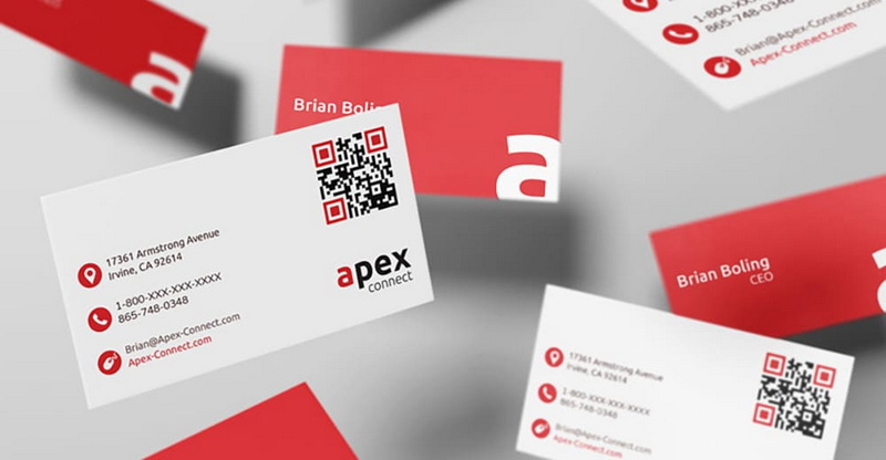
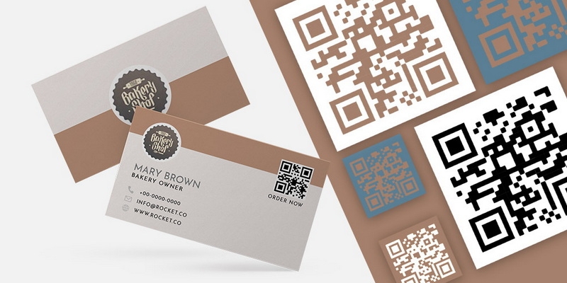
- QR Codes: Direct recipients to your website or portfolio with a scannable QR code. QR codes are a great way to add extra functionality to your business card. You can use them to direct recipients to your website, online portfolio, social media profiles, or any other online resource.
- Tagline or Slogan: A brief statement that encapsulates your brand's mission can enhance memorability. A tagline or slogan is a short, memorable phrase that encapsulates the essence of your brand. It can help to communicate your brand's values, mission, or unique selling proposition.
- Testimonials: Including a short quote from a satisfied client can add credibility. Testimonials are a powerful form of social proof that can help to build trust and credibility with potential clients. If you have positive feedback from satisfied clients, consider including a short quote on your business card.

Materials and Printing Options
The choice of materials significantly affects the perception of your business card. The material you choose can communicate a lot about your brand's quality and attention to detail.
Cardstock Quality
Invest in high-quality cardstock to convey professionalism:
- Thickness: A heavier cardstock feels more substantial and durable. The thickness of your cardstock is measured in points. A higher point value indicates a thicker, more substantial card.
- Finish Options: Consider matte, glossy, or textured finishes to add visual interest. Matte finishes have a smooth, non-reflective surface. Glossy finishes have a shiny, reflective surface. Textured finishes have a tactile surface that adds visual interest.
Printing Techniques
Explore various printing techniques to enhance the appearance of your card:
- Embossing/Debossing: Create a tactile experience by raising or lowering text/designs on the card's surface. Embossing raises the design above the surface of the cardstock, while debossing lowers the design below the surface.
- Foil Stamping: Add metallic foil accents for a luxurious touch. Foil stamping involves applying a thin layer of metallic foil to the cardstock using heat and pressure.
Designing Your Business Card
Concept Development
Begin with brainstorming ideas that reflect your brand's personality and values:
- Target Audience: Tailor your design to appeal to your specific audience or industry. Consider the demographics, interests, and preferences of your target audience when designing your business card.
- Design Inspiration: Look at examples from competitors or design platforms for inspiration. There are many online resources where you can find inspiration for business card designs.
Using Design Software
Utilize graphic design software or online tools to create your business card:
- Templates: Many platforms offer customizable templates that can save time. Using a template can be a good option if you're not a professional designer or if you're short on time.
- Design Principles: Keep in mind basic design principles such as alignment, contrast, and balance throughout the process. These principles are fundamental to creating visually appealing and effective designs.
Finalizing Your Business Card Design
Before printing, take several steps to ensure the final product meets your expectations:
Proofreading
Double-check all text for spelling errors and ensure contact information is accurate. This is a critical step that should not be overlooked.
Feedback
Seek feedback from colleagues or friends to gain different perspectives on the design. Getting feedback from others can help you to identify potential issues or areas for improvement.
Printing Options Comparison
Research printing services and compare pricing, quality, and turnaround times before making a decision. Different printing services offer different pricing, quality, and turnaround times. Be sure to shop around and compare your options before making a decision. Consider requesting samples from different printers to evaluate the quality of their work.
Common Pitfalls to Avoid
- Cluttered Design: Overloading your business card with too much information or too many design elements can make it difficult to read and understand.
- Poor Quality Materials: Using cheap or flimsy cardstock can make your business card look unprofessional and can detract from its overall impact.
- Illegible Font: Choosing a font that is too small, too decorative, or too difficult to read can make your business card ineffective.
- Inconsistent Branding: Failing to align your business card with your overall brand identity can create a disconnect and can weaken your brand image.
- Lack of Proofreading: Overlooking spelling errors or inaccurate contact information can make your business card look unprofessional and can damage your credibility.
The Digital Business Card: A Modern Alternative
In today's increasingly digital world, digital business cards are emerging as a convenient and eco-friendly alternative to traditional paper cards. These cards can be easily shared via email, text message, or QR code, and they can be updated instantly with new information.
Conclusion
Creating professional business cards involves careful consideration of design elements, materials, and functionality. By following the guidelines outlined in this article, you can craft a business card that effectively communicates your brand identity while leaving an impactful impression on those who receive it. Remember to prioritize readability, brand consistency, and high-quality materials to create a business card that truly represents your brand in the best possible light.

Frequently Asked Questions (FAQs)
1. What size should my business card be?
The standard size is 3.5 inches by 2 inches; however, you can choose different sizes based on personal preference or branding needs.
2. How many colors should I use on my business card?
Limit yourself to two or three colors that align with your brand's color scheme to maintain simplicity and coherence.
3. Should I include my photo on my business card?
Including a photo is optional; it may be beneficial in industries where personal branding is crucial but could detract from professionalism in others.
4. What type of paper is best for business cards?
Opt for thick cardstock with a matte or glossy finish for durability and a professional look.
5. How often should I update my business cards?
Update your business cards whenever there are significant changes in contact information or branding elements. Also, consider refreshing your design every few years to keep your brand looking modern and relevant.
Citations:
[1] https://blog.hubspot.com/sales/how-to-design-business-card
[2] https://www.indeed.com/career-advice/career-development/business-card-tips
[3] https://github.com/haoweiguang/haoweiguang.github.io/blob/master/index.html
[4] https://www.brandly.com/blog/10-must-do-rules-for-designing-your-business-card/
[5] https://www.reddit.com/r/startups/comments/7zqczc/a_few_tips_about_business_cards/
[6] https://bbs.gter.net/forum.php?mod=viewthread&action=printable&tid=402330
[7] https://www.vistaprint.com/hub/business-card-design-rules
[8] https://99designs.com/designer-resource-center/designing-business-cards


