Content Menu
● Design Elements of Patrick Bateman's Business Card
>> Typefaces Used
>> Paper Quality and Printing Method
● Influence of Patrick Bateman's Business Card
>> Cultural Significance
● Creating Your Own Business Card Inspired by Patrick Bateman
● Conclusion
● Frequently Asked Questions
>> 1. What is the actual font used on Patrick Bateman's business card?
>> 2. What type of paper is Patrick Bateman's business card printed on?
>> 3. What printing method is used for Patrick Bateman's business card?
>> 4. How can I create a business card inspired by Patrick Bateman's?
>> 5. What is the cultural significance of the business card scene in *American Psycho*?
● Citations:
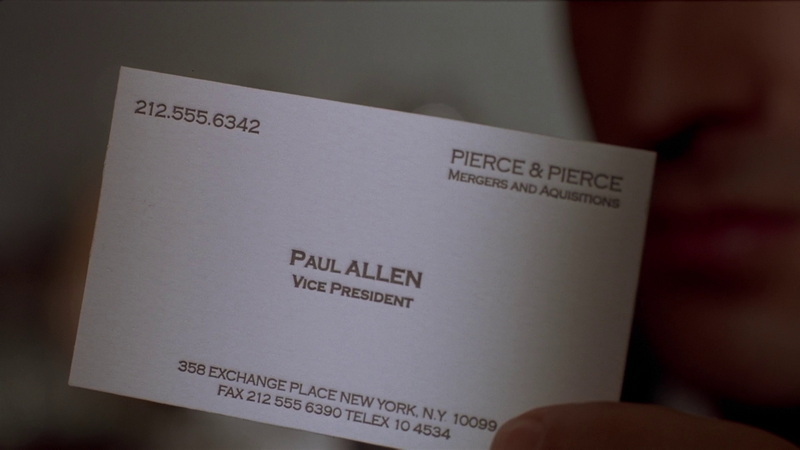
In the iconic 2000 film American Psycho, Patrick Bateman, played by Christian Bale, is a character known for his meticulous attention to detail and obsession with perfection. One of the most memorable scenes in the movie is the business card comparison, where Patrick and his colleagues scrutinize each other's cards, highlighting the minute differences that make each one unique. Patrick's business card, in particular, has become a symbol of elegance and sophistication, despite its fictional font name, "Silian Rail," which is not a real font. The actual font used is believed to be a variant of the Garamond family, specifically Garamond Classico SC.

Design Elements of Patrick Bateman's Business Card
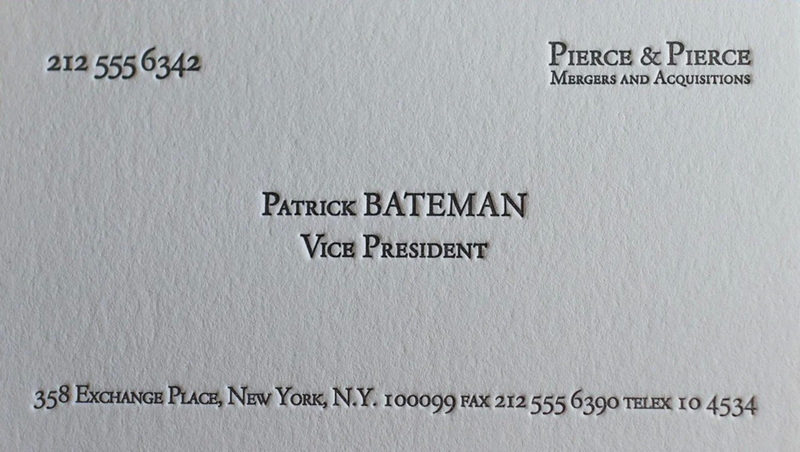
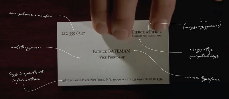
Patrick Bateman's business card is designed with simplicity and elegance in mind. The card features a clean layout with ample white space, ensuring that the most important information—his name and title—is prominently displayed at the center. The company name, "Pierce & Pierce," is placed in the top right corner, while the telephone number is positioned in the top left corner. The fax, address, and other less crucial details are located at the bottom of the card. This strategic placement of information creates a sense of balance and clarity, making the card visually appealing.
Typefaces Used
The typeface used on Patrick Bateman's card is a key element of its design. Although the movie mentions "Silian Rail," this font does not exist. Instead, the actual font is believed to be Garamond Classico SC, a variant of the Garamond family. Garamond is a timeless and classic font that has been widely admired for centuries due to its simplicity and legibility. The use of a single, elegant font throughout the card contributes to its sophisticated appearance.
Paper Quality and Printing Method
The card is printed on "bone" colored paper, which adds to its distinctive look. The printing method used is letterpress, a traditional technique that involves pressing ink into the paper to create a tactile impression. This method gives the card a luxurious feel and enhances its visual appeal.
Influence of Patrick Bateman's Business Card
Patrick Bateman's business card has inspired numerous designs and recreations. Many companies offer custom business card services that allow clients to create their own versions of this iconic card. The card's popularity stems from its association with sophistication and professionalism, making it a sought-after design for those looking to project a similar image.
Cultural Significance
The business card scene in American Psycho is not just about the cards themselves but also about the societal commentary on status and competition. The characters' obsession with the minutest details of their cards reflects the competitive nature of their professional environment. This scene has become a cultural reference point, often used to satirize the superficiality of corporate culture.

Creating Your Own Business Card Inspired by Patrick Bateman
If you're interested in creating a business card inspired by Patrick Bateman's, here are some tips:
1. Choose a Classic Font: Use a timeless font like Garamond or a similar serif font to give your card a sophisticated look.
2. Select High-Quality Paper: Opt for a premium paper that feels luxurious to the touch. Consider using a textured or colored paper to add uniqueness.
3. Keep the Design Simple: Ensure that your card has ample white space and a clear layout. Avoid cluttering the card with too much information.
4. Consider Letterpress Printing: If possible, use letterpress printing to give your card a tactile feel.
Conclusion
Patrick Bateman's business card from American Psycho is a symbol of elegance and sophistication, despite its fictional font name. The actual use of Garamond Classico SC and the card's design elements have made it a timeless classic. Whether you're looking to create a business card for professional purposes or simply as a fan of the film, understanding the design principles behind this iconic card can help you craft a memorable and stylish business card.

Frequently Asked Questions
1. What is the actual font used on Patrick Bateman's business card?
The actual font used on Patrick Bateman's business card is believed to be Garamond Classico SC, not "Silian Rail" as mentioned in the film[1][2][3].
2. What type of paper is Patrick Bateman's business card printed on?
Patrick Bateman's business card is printed on "bone" colored paper[3].
3. What printing method is used for Patrick Bateman's business card?
The printing method used for Patrick Bateman's business card is letterpress, which gives the card a tactile feel[2][3].
4. How can I create a business card inspired by Patrick Bateman's?
To create a business card inspired by Patrick Bateman's, use a classic font like Garamond, select high-quality paper, keep the design simple, and consider letterpress printing[1][2].
5. What is the cultural significance of the business card scene in American Psycho?
The business card scene in American Psycho is a commentary on the superficiality and competitiveness of corporate culture, highlighting how minor differences in appearance can be perceived as significant[7].
Citations:
[1] https://www.elegantepress.com/blog/patrick-bateman-business-card/
[2] https://hobancards.com/products/patrick-bateman
[3] https://hobancards.com/blogs/thoughts-and-curiosities/american-psycho-business-cards
[4] https://www.reddit.com/r/mealtimevideos/comments/td9741/actual_design_analysis_of_the_business_cards_from/
[5] https://www.webfx.com/blog/web-design/free-business-card-templates-inspired-american-psycho/
[6] https://www.youtube.com/watch?v=cISYzA36-ZY
[7] https://www.studiobinder.com/blog/american-psycho-business-card-scene/
[8] https://www.pinterest.com/ideas/american-physco-business-card/950736705580/


