Content Menu
● What Is the Pantone Matching System?
● Why Pantone Colors Matter in Packaging Production
● How Pantone Color Codes Work
● Pantone Spot Color vs. CMYK Process Printing
>> When Pantone Spot Color Is the Better Choice
>> When CMYK Is the Better Choice
● Why a Pantone Color Can Still Change on Packaging
>> Paper and Board Color
>> Surface Coating and Lamination
>> Printing Method
>> Viewing Light
● A Practical Pantone Workflow for Custom Packaging
>> 1. Start With the Correct Brand Specification
>> 2. Confirm the Packaging Material First
>> 3. Decide Whether the Color Needs a Spot Ink
>> 4. Request a Physical Color Proof
>> 5. Approve Color With Clear Tolerances
● Common Mistakes That Cause Packaging Color Problems
>> Using RGB Files for Print Production
>> Selecting a Pantone Color Without Naming the Stock
>> Expecting Metallic Effects From CMYK
>> Approving Only From a Screen
>> Ignoring Finishing During Color Approval
● Expert Packaging Advice: Choose Color by Application, Not by Habit
● Pantone Color Matching for Global Packaging Programs
● Work With a Packaging Supplier That Understands Color
● FAQs
>> What does PMS color mean?
>> Is Pantone the same as CMYK?
>> Can every Pantone color be printed in CMYK?
>> What is the difference between PANTONE C and PANTONE U?
>> Should I use Pantone color for a custom packaging box?
>> Why does my Pantone color look different on kraft paper?
>> Does lamination affect Pantone colors?
>> How can I achieve accurate color on repeat packaging orders?
● References
For a packaging brand, color is not decoration—it is a production specification. The Pantone Matching System (PMS) gives designers, brand owners, and printers a shared color language so a selected brand shade can be communicated more reliably across packaging boxes, labels, inserts, retail displays, and other printed materials.
At Shenzhen XingKun Packing Products Co., Ltd., we have spent more than 20 years producing packaging boxes and a broad range of printed products for brands and distributors in over 30 countries and regions. From our production experience, the most successful color projects begin long before printing: the brand identifies the intended Pantone color, matches it to the actual substrate and finishing process, reviews a physical proof, and confirms realistic tolerances before mass production.
This guide explains what PMS color means, how Pantone codes work, how Pantone compares with CMYK printing, and how to use Pantone colors effectively for custom packaging.

What Is the Pantone Matching System?
The Pantone Matching System, commonly shortened to PMS, is a standardized color-reference system used to identify and communicate specific colors. Each Pantone color is assigned a unique name or number and is displayed in physical color guides.
Instead of describing a color as "deep blue," "bright red," or "warm beige," a designer can specify a precise Pantone reference. This gives the packaging supplier, ink supplier, printer, and brand team a common point of reference.
For example, a company may specify a particular red as PANTONE 186 C. The number identifies the color, while the letter indicates the paper type or guide version used for that reference.
Pantone is especially valuable when a color is central to brand recognition. A logo color that looks correct on a folding carton but noticeably different on a hang tag, paper bag, or shipping insert can weaken the overall presentation of a brand.
However, one important practical point must be understood: a Pantone code is not a guarantee that color will look identical on every material or under every light source. Paper color, coating, printing method, ink coverage, varnish, lamination, texture, and viewing conditions all affect the finished result.
Why Pantone Colors Matter in Packaging Production
Packaging is often the first physical interaction a customer has with a product. Color influences shelf visibility, perceived quality, category recognition, and brand recall.
For this reason, Pantone colors are often requested for:
- Brand logos and signature colors
- Premium folding cartons
- Rigid gift boxes
- Cosmetic and skincare packaging
- Food and beverage sleeves
- Pharmaceutical cartons
- Retail display packaging
- Paper bags, tissue paper, and inserts
- Labels, stickers, and hang tags
- Corporate stationery and promotional materials
A standard reference is particularly useful when several suppliers are producing different branded items. For instance, one supplier may manufacture custom packaging boxes, while another produces brochures, promotional cards, and retail signage. Without a shared color specification, each supplier may interpret the artwork differently.
A properly specified Pantone color helps reduce subjective instructions such as "make it closer to the sample" or "print the blue more vibrant." It turns a visual preference into a production target.
How Pantone Color Codes Work
Pantone color names often include a number followed by a suffix. The suffix matters because the same ink can appear different on different paper stocks.
| Pantone Suffix |
Meaning |
Typical Packaging Impact |
| C |
Coated paper |
Usually appears brighter, smoother, and more saturated |
| U |
Uncoated paper |
Usually appears softer, more absorbent, and less vivid |
| M |
Matte paper |
May reduce glare and create a more muted appearance |
| CP |
Process simulation on coated stock |
Indicates a four-color process approximation |
| UP |
Process simulation on uncoated stock |
Indicates a four-color process approximation on uncoated paper |
For example, PANTONE 186 C and PANTONE 186 U are related color references, but they should not be expected to look exactly the same. Coated paper reflects light differently and absorbs less ink than uncoated paper. As a result, the coated version may look richer and more intense.
This is why packaging specifications should never state only "Pantone 186" when the material is already known. A more complete instruction would be:
> Print the logo in PANTONE 186 C on 350 gsm coated art paper with matte lamination.
That single line gives a production team much more useful information.
Pantone Spot Color vs. CMYK Process Printing
One of the most important packaging decisions is whether to use a Pantone spot color or a CMYK process color.
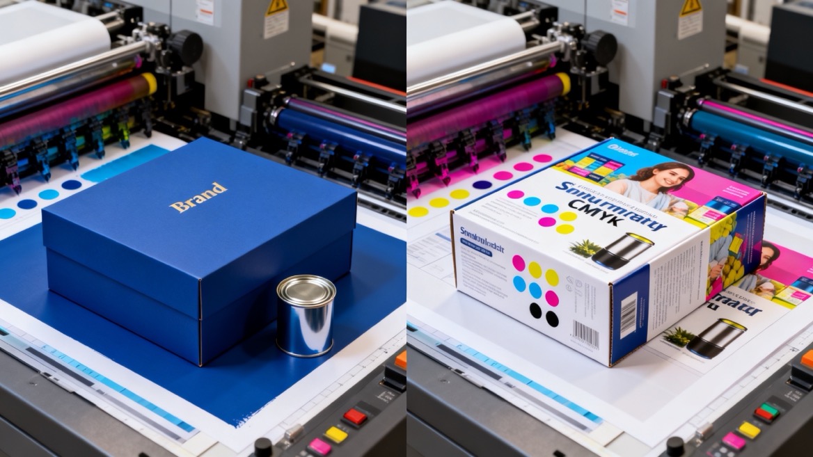
A Pantone spot color is a specially mixed ink printed as its own ink unit. CMYK printing creates colors by combining cyan, magenta, yellow, and black inks in tiny dots.
Neither method is universally better. The right choice depends on artwork, quantity, budget, color expectations, printing method, and packaging material.
| Feature |
Pantone Spot Color |
CMYK Process Color |
| Ink method |
Pre-mixed dedicated ink |
Four standard inks combined in varying percentages |
| Best for |
Logos, signature brand colors, solid color areas |
Photos, gradients, illustrations, multi-color artwork |
| Color consistency |
Strong when the material and process are controlled |
Can vary according to press condition, substrate, and profiling |
| Color range |
Includes many bright, metallic, and specialty options |
Limited by the achievable four-color printing gamut |
| Production setup |
May require an additional printing unit or plate |
Usually uses standard four-color production |
| Cost suitability |
Often efficient for simple one- or two-color artwork |
Often efficient for full-color artwork |
| Packaging use |
Branded cartons, sleeves, bags, labels, premium boxes |
Product photography, detailed graphics, multi-color retail packaging |
When Pantone Spot Color Is the Better Choice
Use a Pantone spot color when:
- Your logo includes a signature color that must remain highly consistent
- Your artwork uses one to three solid colors
- The package has large, flat color areas
- You need colors outside the normal CMYK range
- You are printing metallic, fluorescent, or other specialty inks
- Brand approval depends on close visual matching
For example, a premium jewelry box with a distinctive turquoise logo may benefit from a dedicated spot color. If that same color is built from CMYK, its appearance may shift slightly from one press condition or material to another.
When CMYK Is the Better Choice
CMYK is often the more practical option when:
- The design includes full-color product photography
- The packaging uses illustrations with many colors
- The artwork contains detailed gradients
- The print run is short or digitally produced
- The brand can accept a close process-color approximation
- Budget efficiency is more important than exact spot-color reproduction
A cosmetic carton featuring a high-resolution product image, floral illustrations, and multiple color transitions will normally require CMYK. If the logo color is critical, it may be printed as an additional Pantone spot color alongside CMYK, often referred to as a 4C + 1 spot color job.
Why a Pantone Color Can Still Change on Packaging
A common misunderstanding is that selecting a Pantone number eliminates all color variation. In reality, Pantone provides a target reference, while the final packaging appearance is influenced by several manufacturing variables.
Paper and Board Color
Bright white coated board provides a different visual base from natural kraft paper, greyboard, recycled paper, or ivory paperboard.
A vivid orange printed on white coated paper can look clean and energetic. The same ink on brown kraft paper may look darker, warmer, and less saturated because the substrate color shows through or influences the perceived result.
Surface Coating and Lamination
Finishing changes how light reflects from packaging.
- Gloss lamination can make colors appear deeper and more saturated
- Matte lamination creates a softer, more premium appearance
- Soft-touch lamination can slightly alter visual depth while adding a tactile feel
- Aqueous varnish may protect the surface while retaining a more natural paper feel
- UV coating can create selective contrast between glossy and matte areas
For a luxury rigid box, a deep navy Pantone color with matte lamination may look elegant and restrained. The same color with gloss lamination may appear more vivid and reflective.
Printing Method
Offset printing, flexographic printing, digital printing, screen printing, and gravure printing each have different capabilities and production controls.
Offset printing is commonly selected for high-quality paperboard packaging and detailed graphics. Flexographic printing is widely used for labels, corrugated packaging, and flexible packaging. Digital printing is often suitable for short runs, versioned packaging, and rapid sampling.
Packaging production standards also recognize that print conditions must be controlled across the full workflow—from color separation and proofing through production printing and finishing. This is particularly relevant in flexographic packaging, where substrate and press variables can influence the final result.
Viewing Light
A color can look different under daylight, warm retail lighting, office LEDs, or warehouse lighting. This effect is called metamerism—two colors may appear similar under one light source but different under another.
For packaging intended for retail shelves, approval should ideally consider the lighting environment where the product will be displayed.
A Practical Pantone Workflow for Custom Packaging
The most reliable way to achieve good color results is to treat color approval as a structured process rather than a last-minute print instruction.
1. Start With the Correct Brand Specification
Provide the original logo files and identify the exact color references used by the brand.
The preferred files are:
- Adobe Illustrator AI files
- Editable PDF files with vector artwork
- EPS files
- High-quality SVG files
- Print-ready PDF files with outlined fonts or embedded fonts
Avoid relying on screenshots, low-resolution JPEG files, or colors sampled from a website. Screen colors are created with light, while printed colors are created with ink on a physical surface.
2. Confirm the Packaging Material First
Before choosing a color target, identify the actual substrate:
- Coated art paper
- Uncoated paper
- Kraft paper
- Corrugated board
- Specialty textured paper
- Metallized paper
- Plastic film
- Fabric or textile material
The substrate is part of the color system. A color approved on coated art paper should not automatically be expected to match on uncoated kraft paper.
3. Decide Whether the Color Needs a Spot Ink
Ask one practical question:
> Is this color a core part of the brand identity, or is a close visual reproduction acceptable?
If it is a signature color, a Pantone spot ink may be appropriate. If the artwork is photographic or highly detailed, CMYK may be the better production choice.
For complex projects, use a hybrid specification. For example:
- CMYK for product image and background illustration
- One Pantone spot color for the logo
- One metallic ink for a premium detail
- Embossing or foil stamping for tactile emphasis
4. Request a Physical Color Proof
A digital proof is useful for checking layout, spelling, die lines, and general placement. It should not be treated as final color approval because monitors vary in brightness, calibration, and color profile.
For color-critical packaging, request one or more of the following:
- Printed color drawdown
- Press proof
- Digital hard proof
- Sample box made with the intended paper and finish
- Pre-production sample before full manufacturing
The closer the proof is to the final material and finishing process, the more meaningful the approval will be.
5. Approve Color With Clear Tolerances
The goal should be commercially acceptable consistency, not an unrealistic expectation of zero variation.
For high-volume production, small variation can occur because of ink density, paper batches, humidity, press setup, and finishing conditions. A qualified packaging supplier should communicate these factors early and retain approved samples for comparison during repeat orders.

Common Mistakes That Cause Packaging Color Problems
Color complaints often begin with unclear specifications rather than poor printing. Avoid these common issues.
Using RGB Files for Print Production
RGB is designed for digital screens. It can display bright colors that may not be achievable with CMYK inks. Convert artwork correctly and discuss any critical brand colors before production.
Selecting a Pantone Color Without Naming the Stock
A Pantone reference without a coated or uncoated designation can create unnecessary confusion. Always specify the guide suffix that matches the intended substrate.
Expecting Metallic Effects From CMYK
CMYK can simulate a gold or silver appearance, but it cannot create the true reflective effect of metallic ink, metallic foil, or metallized paper.
If a luxury metallic effect is essential, consider:
- Pantone metallic ink
- Hot foil stamping
- Cold foil transfer
- Metallized paper or film
- Holographic material
- Raised UV combined with foil
Approving Only From a Screen
A monitor cannot accurately predict how ink will interact with paper, board, lamination, texture, and lighting. Screen approval alone is risky for brand-sensitive packaging.
Ignoring Finishing During Color Approval
A color that looks correct before lamination may look slightly different after gloss, matte, or soft-touch finishing. Approve the combination—not only the printed sheet.
Expert Packaging Advice: Choose Color by Application, Not by Habit
From a manufacturer's perspective, the best color decision is not always "use Pantone" or "use CMYK." It is choosing the production method that fits the packaging objective.
| Packaging Requirement |
Recommended Approach |
| One-color logo on a premium mailer box |
Pantone spot color |
| Full-color skincare carton with product photography |
CMYK, with an optional Pantone logo color |
| Natural eco-friendly kraft box |
Test Pantone color on kraft; expect a softer result |
| Luxury gift box with gold details |
CMYK or Pantone base colors plus foil stamping |
| Short-run event packaging |
Digital CMYK, with a physical proof for critical colors |
| Large retail campaign across multiple printed items |
Pantone reference plus approved production samples |
A well-planned color system also helps when a brand expands into new packaging formats. The same identity may need to work across folding cartons, rigid boxes, paper bags, corrugated shippers, labels, tissue paper, and marketing inserts. Establishing approved materials, finishes, and color references early reduces repeated decision-making later.
Pantone Color Matching for Global Packaging Programs
Brands working with international suppliers should build a simple color-control document for each packaging line. This is especially useful when products are reordered, manufactured in different batches, or distributed across multiple markets.
The document should include:
- Pantone color number and suffix
- CMYK values for process-color fallback
- RGB and HEX values for digital use
- Approved material specification
- Paper or board weight
- Lamination or varnish type
- Foil color, if applicable
- Approved physical sample photographs
- Notes on acceptable visual variation
- Date and version number of the approved artwork
Pantone's Color Bridge guides are useful because they display Pantone spot colors beside their closest CMYK process simulations. This allows a brand to see when process printing may be a reasonable alternative and when a dedicated spot ink is needed. Pantone also notes that CMYK conversions depend on the specific substrate and print conditions, so guide values should be treated as a starting point rather than an absolute guarantee.
Work With a Packaging Supplier That Understands Color
Color consistency depends on communication, material knowledge, press control, proofing, and approval discipline. The supplier should not simply receive a Pantone code and start production. They should ask the right questions about the substrate, print method, finishing, intended viewing conditions, and brand expectations.
At Shenzhen XingKun Packing Products Co., Ltd., our team helps brands translate artwork into practical packaging specifications. Whether you need custom folding cartons, rigid boxes, corrugated mailer boxes, paper bags, labels, inserts, or other printed materials, we can review your color requirements before mass production.
Send us your artwork, Pantone references, box dimensions, material preference, quantity, and finishing requirements. We can help you evaluate whether Pantone spot color, CMYK, or a combined printing approach is the most suitable option for your packaging project.
FAQs
What does PMS color mean?
PMS means Pantone Matching System. It is a standardized color-reference system that assigns specific names or numbers to colors, helping designers and printers communicate color requirements more clearly.
Is Pantone the same as CMYK?
No. Pantone spot colors are generally pre-mixed inks printed as dedicated colors, while CMYK creates colors by combining cyan, magenta, yellow, and black inks. CMYK is ideal for full-color images, while Pantone is often preferred for color-critical logos and solid brand colors.
Can every Pantone color be printed in CMYK?
No. Some Pantone colors, especially very bright, highly saturated, metallic, and fluorescent shades, cannot be reproduced exactly with standard CMYK inks. A Color Bridge guide can help estimate the closest CMYK alternative.
What is the difference between PANTONE C and PANTONE U?
"C" refers to coated paper, while "U" refers to uncoated paper. The same color family can look different on these surfaces because coated and uncoated papers absorb and reflect light differently.
Should I use Pantone color for a custom packaging box?
Use Pantone color when brand consistency is critical, particularly for logos, signature colors, large solid color areas, or premium packaging. Use CMYK when your design includes photographs, illustrations, gradients, or many colors. Many packaging projects use both methods together.
Why does my Pantone color look different on kraft paper?
Kraft paper is naturally brown or tan and more absorbent than white coated paper. This changes the apparent brightness and saturation of printed ink. For color-critical kraft packaging, request a physical sample or print proof before approving production.
Does lamination affect Pantone colors?
Yes. Gloss, matte, soft-touch, and other finishing treatments can alter perceived color depth, reflectivity, and saturation. Approve the final color after the intended finishing process whenever possible.
How can I achieve accurate color on repeat packaging orders?
Keep an approved physical sample, record Pantone references and material details, use version-controlled artwork, and work with a supplier that reviews production requirements before each repeat order.
References
1. [Pantone: Color Systems for Graphic Design]
2. [Pantone: Color Bridge Guide Set—Coated and Uncoated]
3. [Pantone: Color Bridge—What Changed?]
4. [Pantone: Color for Print and Packaging—Which Guide Is Right for You?]
5. [Pantone: Spot Color vs. Process Color Printing]
6. [ISO 12647-6: Flexographic Printing Process Control]
7. [Original Article: What Is Pantone Color Matching System?]


