Content Menu
● What Is POP Display Printing?
● Why Print Quality Changes Retail Performance
● Three Main POP Display Printing Methods
>> Lithographic Printing for Premium Graphics
>> Flexographic Printing for Simple, High-Volume Programs
>> Digital Printing for Speed and Flexibility
● How to Select the Right Printing Method
● Start with Structure, Not Surface Graphics
● A Production-Ready Artwork Checklist
● Color Control: From Brand Swatch to Finished Display
● Materials and Finishes That Support the Campaign
● Build for Retail Handling and Shipping Reality
● Printed Displays for Today's Retail Journey
● Partner with a Display Manufacturer Early
● FAQ
>> What is the best printing method for POP displays?
>> Can corrugated cardboard displays look premium?
>> Should I create artwork before choosing a display structure?
>> How can I keep brand colors consistent across repeat orders?
>> Are QR codes suitable for printed retail displays?
>> What information should I provide when requesting a quotation?
● References
A POP display has only a few seconds to earn attention. Its printed graphics must communicate the product, campaign, and brand promise before a shopper walks past. For that reason, POP display printing is not simply about placing artwork on cardboard. It is a coordinated process involving structural design, substrate selection, color control, finishing, packing, and retail execution.
At Shenzhen XingKun Packing Products Co., Ltd., we have spent more than 20 years producing display stands and a broad range of printed packaging products for brands and distributors in over 30 countries and regions. From our production perspective, the strongest retail display is created when printing decisions are made together with structural and logistics decisions—not after the display shape has already been finalized.
This guide explains how to choose a POP display printing method, prepare production-ready artwork, avoid common quality issues, and build a display program that works from factory floor to retail shelf.
What Is POP Display Printing?
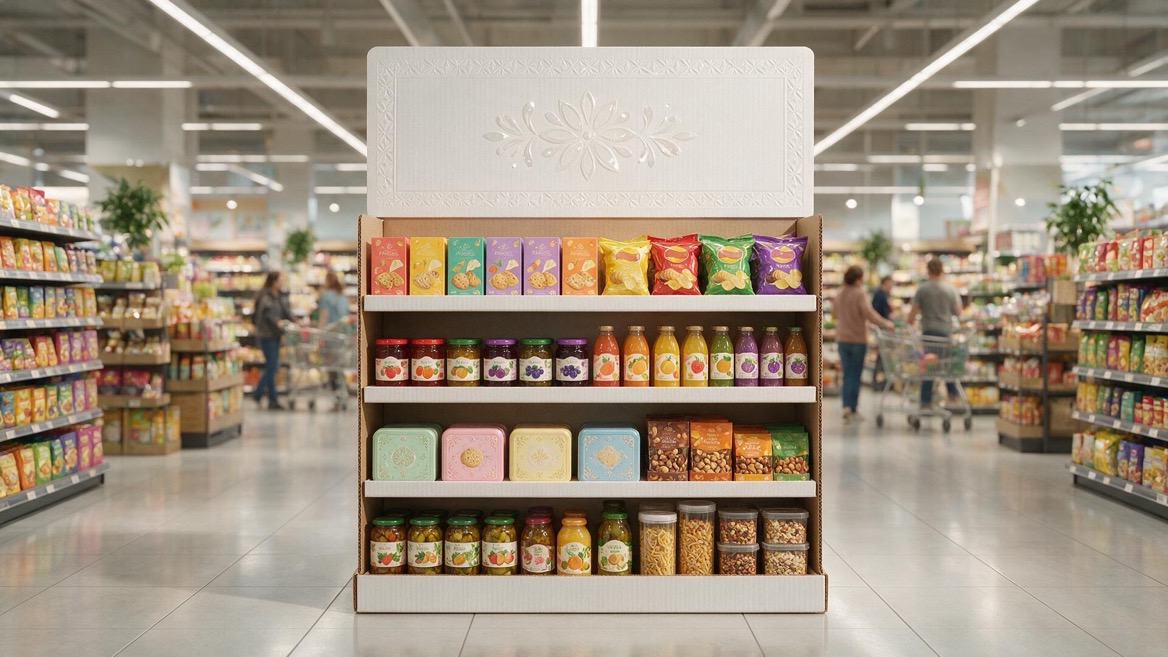
POP display printing is the process of applying brand graphics, product information, promotional messages, and visual effects to a point-of-purchase display. These displays may be placed on retail floors, end caps, counters, pallets, shelves, or near checkout areas.
The goal is straightforward: make products easier to notice, understand, and purchase.
A well-printed display must do more than look attractive in a digital mock-up. It must remain readable under store lighting, survive transport, assemble correctly, hold the intended product weight, and present consistent brand color across every retail location.
Common printed display elements include:
- Brand identity: Logos, signature colors, taglines, and campaign visuals
- Product communication: Product images, benefits, usage instructions, and comparison points
- Retail navigation: Headers, shelf strips, category labels, and callout panels
- Promotional messaging: New-launch announcements, bundles, limited-time offers, and price communication
- Interactive prompts: QR codes that lead shoppers to product demonstrations, registration pages, loyalty programs, or online ordering
The best design does not try to say everything. It gives shoppers one clear reason to stop and one easy next step.
Why Print Quality Changes Retail Performance
Retail displays compete with shelves, signage, packaging, lighting, and other promotions. When graphics are dull, text is too small, or colors vary from one unit to another, the display can lose impact before a customer notices the product.
Print quality affects four practical outcomes:
| Retail requirement | What printing must achieve |
| Distance visibility | Large, high-contrast graphics that can be recognized from the aisle |
| Brand consistency | Controlled color reproduction across print runs and markets |
| Product clarity | Images and copy that remain sharp at close viewing distance |
| Campaign durability | Surfaces and materials appropriate for handling, stock replenishment, and store conditions |
In our experience, a technically correct print file can still create a weak display if the design ignores viewing distance. A small paragraph may look readable on a laptop but disappear on a busy retail floor. Likewise, a beautiful lifestyle image may fail when it competes with a crowded shelf.
Before finalizing graphics, ask one important question: What should a shopper understand in three seconds? The answer should guide the headline, image hierarchy, and visual contrast.
Three Main POP Display Printing Methods
The right print method depends on quantity, artwork complexity, color expectations, timeline, and display material. There is no universal "best" option. The best option is the one that fits the commercial objective and production conditions.
Lithographic Printing for Premium Graphics
Lithographic printing, often called offset printing, transfers ink through printing plates and a rubber blanket before applying it to paper. For corrugated POP displays, the printed sheet is commonly mounted to corrugated board after printing.
This method is a strong choice for brands that need refined images, smooth gradients, detailed photography, and reliable reproduction across large-volume campaigns.
Best suited for:
- Large production quantities
- Beauty, food, electronics, and consumer-product launches
- Photography-heavy campaigns
- Complex artwork and detailed color transitions
- Premium displays requiring a polished finish
Lithographic printing generally involves more setup than digital printing. However, once the production run is large enough, it can offer strong efficiency and dependable visual consistency.
Flexographic Printing for Simple, High-Volume Programs
Flexographic printing applies ink directly to the substrate through flexible relief plates. It is commonly used for corrugated packaging and displays with bold graphics, limited colors, and repeatable visual elements.
Flexography works particularly well when the display depends on a strong logo, a simple brand palette, large text, and broad areas of color rather than high-detail photography.
Best suited for:
- High-volume corrugated display programs
- One- to three-color artwork
- Simple logos, line art, and graphic patterns
- Cost-sensitive promotional rollouts
- Designs with large solid-color areas
Brands should plan flexographic artwork carefully. Fine text, subtle gradients, and highly detailed images may not deliver the same visual result as premium lithographic production.
Digital Printing for Speed and Flexibility
Digital printing sends artwork directly from a digital file to the printing system without traditional plates. It is especially valuable for short runs, prototypes, regional campaigns, and projects requiring frequent creative updates.
For example, a brand testing three promotional concepts across selected stores can use digital printing to produce smaller quantities without committing to a large initial run.
Best suited for:
- Samples and structural prototypes
- Short-run retail campaigns
- Seasonal promotions
- Test-market programs
- Regionalized graphics and multiple language versions
- Fast-turnaround projects
Digital printing provides flexibility, but it should not be treated as a shortcut around production planning. The display still needs approved artwork, structural validation, suitable material selection, and packing protection.
How to Select the Right Printing Method
Use the following decision framework before requesting a quotation.
| Project factor | Lithographic | Flexographic | Digital |
| Order quantity | Best for large runs | Best for very large runs | Best for short runs |
| Image detail | Excellent for photographs | Best for simple graphics | Strong for detailed artwork |
| Setup requirement | Higher | Higher | Lower |
| Lead-time flexibility | Moderate | Moderate | High |
| Version changes | Less flexible | Less flexible | Highly flexible |
| Typical display goal | Premium visual impact | Efficient bold branding | Testing, speed, customization |
A practical rule is simple: choose the display objective before choosing the print process.
If the campaign requires premium photography and a broad retail rollout, lithographic production may be the most suitable route. If the artwork is simple and the quantity is high, flexography can provide excellent efficiency. If speed, testing, or regional customization matters most, digital production may be the smarter choice.
Start with Structure, Not Surface Graphics
One of the most common display-development mistakes is finalizing artwork before confirming the structure. A display is not a flat poster. It has folds, panels, shelf edges, die-cut windows, glue areas, load-bearing sections, and possible assembly instructions.
Graphics should support the structure rather than fight it.
For example, a logo placed across a fold can look distorted after assembly. Small copy placed too close to a die-cut edge can become difficult to read. A dark printed area on a high-contact section may show scuffing faster than a lighter finish. These problems are easier and less expensive to solve during artwork preparation than after mass production begins.
Before approving the artwork, confirm:
1. Viewing panels: Identify which panels customers will see first.
2. Structural zones: Mark folds, glue flaps, locking tabs, shelf edges, and die-cut areas.
3. Product load: Confirm the intended product weight, shelf arrangement, and replenishment method.
4. Assembly sequence: Ensure instructions are clear for store teams or co-packing operations.
5. Transit protection: Check whether exposed edges, printed corners, or headers need extra protection.
A structurally practical display can reduce damages, simplify store setup, and protect the appearance of the printed campaign.
A Production-Ready Artwork Checklist
A professional print file reduces back-and-forth communication and helps protect color, legibility, and die-cut accuracy. Before submitting files for a display stand project, complete this checklist.
- Use the approved dieline. Build artwork only on the confirmed structural template.
- Keep cut, crease, perforation, and glue guides separate. These technical layers should not appear in final printed graphics.
- Add adequate bleed. Extend background colors and images beyond the cut line to avoid visible white edges.
- Maintain a safety margin. Keep important text, barcodes, faces, and logos away from folds and trim edges.
- Convert or package fonts. Avoid missing-font substitutions during file processing.
- Check image resolution. Low-resolution images can appear soft or pixelated at display scale.
- Confirm color expectations. Provide brand color references and define whether a physical proof is required.
- Verify barcodes and QR codes. Test them at final printed size before approval.
- Review the assembled view. A flat artwork file cannot fully show how panels align after assembly.
For a multi-country program, we also recommend locking the approved artwork version, color target, material specification, and packing standard in one controlled production brief. This helps prevent avoidable differences between repeat orders.
Color Control: From Brand Swatch to Finished Display
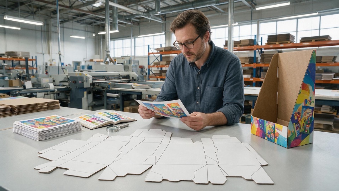
Color is often the first issue a brand team notices and the hardest issue to discuss after production is complete. Screens, proofing systems, inks, paper, board surfaces, coatings, and store lighting can all influence perceived color.
The right approach is to define expectations early.
A good color-control process includes:
- Approved color references for critical brand colors
- A confirmed substrate and surface finish
- Pre-production proofs for high-risk artwork
- Measurable production controls where appropriate
- Clear approval records before full production
- Retained samples for repeat-order comparison
Color appearance can also change between coated paper, uncoated paper, corrugated board, and different finishing treatments. A bright logo printed on one surface may appear more muted on another. Therefore, brand color should be evaluated on the actual intended material—not only on a screen or a standard paper proof.
For major product launches, physical samples are especially valuable. They allow the brand team to assess color, texture, readability, structure, and product fit together.
Materials and Finishes That Support the Campaign
Corrugated cardboard remains a highly practical material for temporary and semi-temporary POP displays. It is lightweight, printable, adaptable to many structural styles, and efficient for shipping when properly engineered.
However, "cardboard display" is not a single specification. Board grade, flute type, liner quality, print method, lamination, coating, and product weight all influence the final result.
Consider these finishing options:
| Finish option | Practical benefit |
| Matte lamination | Reduces glare and creates a refined visual effect |
| Gloss lamination | Adds visual brightness and can enhance color vibrancy |
| UV coating | Highlights selected graphics or adds surface protection |
| Spot UV | Creates contrast on logos, product images, or callouts |
| Foil stamping | Adds premium metallic accents for selected applications |
| Embossing or debossing | Introduces tactile brand detail on suitable components |
Finishes should be chosen for a purpose. A premium effect may be valuable for cosmetics or gifting, while a fast-moving promotional display may prioritize cost efficiency, quick production, and easy recycling.
Where recovery after use is part of the campaign plan, minimize unnecessary mixed materials and clarify local disposal requirements before choosing coatings, films, or non-paper accessories.
Build for Retail Handling and Shipping Reality
A display that looks perfect at factory inspection can still fail if it is not designed for transport, storage, assembly, and daily replenishment.
We advise clients to evaluate the entire journey:
- Can the display be shipped flat to save freight volume?
- Does it require pre-assembly, partial assembly, or store assembly?
- Will retail staff understand the setup without tools?
- Can the header, shelves, and product dividers resist normal handling?
- Does the outer carton protect printed surfaces from compression and abrasion?
- Are replacement components needed for long campaign periods?
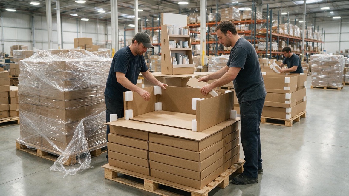
For export programs, packing is part of display engineering. Carton dimensions, pallet pattern, moisture protection, shipping marks, and loading efficiency should be considered before production—not added at the end.
A display that saves a small amount in material cost but causes store setup delays or transit damage is rarely the economical option.
Printed Displays for Today's Retail Journey
Printed POP displays are increasingly designed as physical entry points to digital product experiences. A QR code can connect a shopper to a product demo, a recipe, a comparison guide, a warranty registration page, or an online store.
The key is relevance. A code should offer a useful next step, not simply redirect people to a generic homepage.
Effective applications include:
- Product tutorials for items requiring explanation
- Ingredient, material, or care information
- Store-specific promotions
- Product registration and post-purchase support
- Limited-edition campaign content
- Loyalty program enrollment
Keep the code visible, large enough to scan, and paired with a clear instruction such as "Scan to see it in use" or "Scan for product details." Test it under real retail lighting and from the expected scanning distance.
Partner with a Display Manufacturer Early
The strongest display programs involve the manufacturer before artwork, material, and shipping specifications are locked. Early collaboration can reveal ways to improve structural strength, simplify assembly, reduce waste, protect graphic quality, and optimize packing.
At XingKun, we support display stand projects through a coordinated process: requirement review, structural development, material recommendation, artwork checks, sampling, production, inspection, and export-oriented packing. Our goal is not merely to print graphics. It is to help turn a campaign concept into a display that arrives ready for retail execution.
If you are planning a custom POP display, send us your product dimensions, target quantity, retail environment, artwork status, launch schedule, and destination market. Our team can recommend a practical printing and packaging route for your project.
FAQ
What is the best printing method for POP displays?
Lithographic printing is often preferred for large runs with premium graphics and detailed images. Flexographic printing is efficient for high-volume, simple-color designs. Digital printing is well suited to prototypes, short runs, and fast-changing campaigns.
Can corrugated cardboard displays look premium?
Yes. High-quality graphics, suitable board selection, clean structural design, lamination, spot effects, foil, and precise finishing can create a premium retail presentation.
Should I create artwork before choosing a display structure?
No. Start with a confirmed structural concept and dieline. This prevents key artwork from falling on folds, glue areas, die-cut openings, or high-wear edges.
How can I keep brand colors consistent across repeat orders?
Approve physical samples, define color references, retain approved standards, specify the substrate and finish, and document the production requirements for future orders.
Are QR codes suitable for printed retail displays?
Yes, when they lead to useful content such as demonstrations, product information, registration, or promotions. The code must be tested at final size and under realistic store conditions.
What information should I provide when requesting a quotation?
Provide product dimensions and weight, display quantity, intended retail location, campaign duration, artwork files or design direction, preferred material, required finish, delivery destination, and target launch date.
References
1. [Creative Displays Now, "Part 3: POP Display Printing"] [creativedisplaysnow]
2. [ISO, "ISO 12647-2:2013—Process Control for Offset Lithographic Processes"] [iso]
3. [Fogra, "Media Wedge CMYK and PDF/X Workflow Tools"] [pso-insider]
4. [Forest Stewardship Council, "Paper & Packaging"] [fsc]
5. [FEFCO, "Standards and Guidelines Relating to the Corrugated Industry"] [fefco]
6. [Lahlouh, "2026 Print Marketing Trends"] [lahlouh]
7. [Precision Images, "Print Trends 2026: Signage, Branding and Display Graphics"] [precisionimages]


