Content Menu
● Why Retail Display Colors Matter
● How Color Influences Shoppers
● Choosing Colors for Display Stands
● Matching Color to Product Type
>> Food and Beverage
>> Industrial and B2B Products
>> Retail Promotions
● Color in the Full Display Environment
● Design Rules That Improve Results
>> Keep the palette simple
>> Use contrast with purpose
>> Protect brand consistency
>> Let the product lead
>> Test before mass production
● Common Mistakes to Avoid
● Practical Steps for Brands
● Conclusion
● FAQ
>> 1. What are retail display colors?
>> 2. Why are retail display colors important?
>> 3. Which color works best for retail displays?
>> 4. Do bright colors always work better?
>> 5. Should packaging and display colors match?
>> 6. How can manufacturers test display colors?
● References
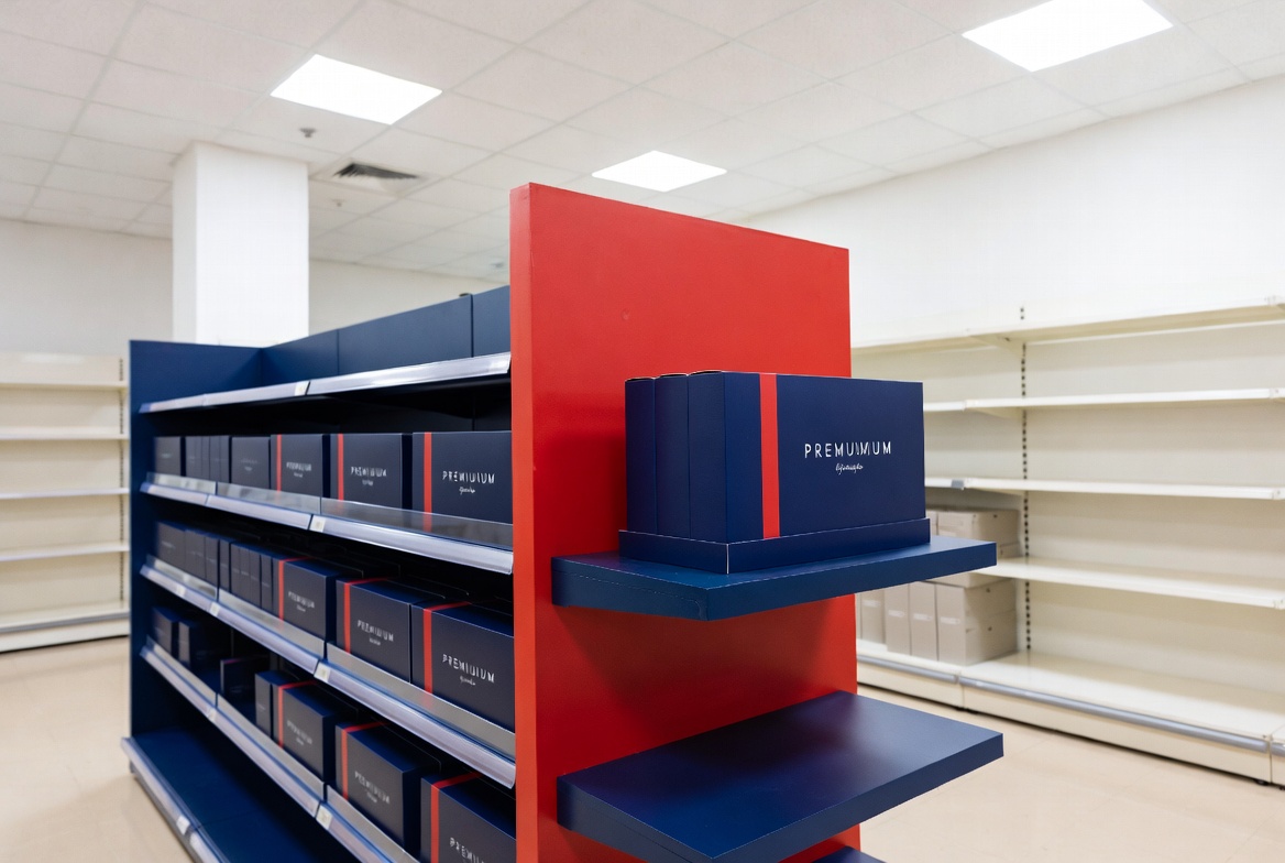
Retail display colors do more than make a store look attractive. They help guide attention, influence mood, and shape how shoppers judge a product before they read a single word. In a busy retail environment, the right color choice can make a display feel clearer, more inviting, and more persuasive.
For brands using custom display stands, packaging, or point-of-sale materials, color is a practical sales tool. It can support product visibility, strengthen brand recognition, and help customers understand what kind of product they are looking at much faster.
Why Retail Display Colors Matter
Shoppers often make quick decisions. Before they compare features or read labels, they respond to visual cues such as color, contrast, and overall layout. A display that uses color well can make a product stand out and feel easier to trust.
Color also helps tell a story. Bright colors may suggest energy and urgency, while softer tones can create a calm and refined impression. In retail, that first impression matters because it affects whether a shopper stops, looks closer, and picks up the product.
How Color Influences Shoppers
Different colors create different emotional impressions, although these meanings can vary by category and market. Some colors are naturally associated with specific product traits, which is why they are used so often in retail design.
Common color associations include:
- Red: urgency, excitement, action.
- Blue: trust, calm, reliability.
- Green: freshness, nature, health.
- Yellow: brightness, optimism, affordability.
- Black: premium quality, elegance, authority.
- White: cleanliness, simplicity, clarity.
- Brown: earthiness, warmth, natural appeal.
These associations are useful, but they work best when they match the product and the brand message. A color that feels right for one category may feel confusing in another.
Choosing Colors for Display Stands
The best display color is the one that supports the product story. A strong color choice should help the product stand out without overpowering it.
Here is a simple guide:
| Goal | Suggested Color Direction | Effect |
| Attract attention | Red, orange | Creates energy and urgency |
| Build trust | Blue, white | Feels stable and clean |
| Show freshness | Green, light blue | Suggests health and purity |
| Create premium value | Black, deep purple, gold | Feels refined and high-end |
| Highlight promotions | Yellow, red | Draws the eye quickly |
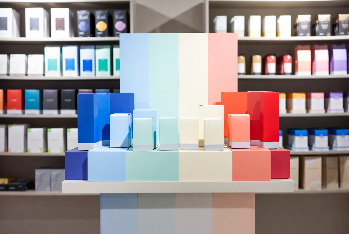
A display usually works best with one dominant color, one support color, and one accent color. This keeps the design balanced and easy to understand.
Matching Color to Product Type
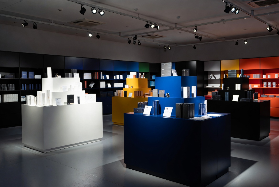
Color should always fit the type of product being sold. A display color that works for snacks may not work for industrial products or cosmetics.
Food and Beverage
Warm colors often work well for products that feel indulgent, bold, or energetic. Cooler colors are often better for products that are positioned as fresh, healthy, or light.
Industrial and B2B Products
For technical or industrial items, the color palette should communicate clarity, professionalism, and reliability. Blue, gray, white, and black are often strong choices because they support a more serious and trustworthy impression.
Retail Promotions
Seasonal or limited-time promotions can use brighter colors to create urgency. These colors help communicate that the offer is timely and worth noticing quickly.
Color in the Full Display Environment
Color does not work alone. It is always seen in context. A display that looks strong in a design file may look very different under store lighting or next to competing products.
That is why the surrounding environment matters so much. The store's wall colors, shelf colors, lighting temperature, and nearby brands all affect how a display color is perceived. A good design should stand out clearly while still feeling appropriate for the space.
To improve color performance, brands should:
1. Review the store environment before selecting colors.
2. Check how the display looks under real lighting.
3. Compare the design with nearby competitors.
4. Test whether the display still feels clear from several angles.
5. Make sure the product remains the visual focus.
Design Rules That Improve Results
A display should be easy to understand at a glance. Color plays a major role in making that happen.
Keep the palette simple
Too many colors can create visual noise. A simple palette is easier to remember and faster to process.
Use contrast with purpose
Contrast helps highlight the product, key message, or promotion. But too much contrast can make the design feel chaotic.
Protect brand consistency
The display color should support the brand's overall image. A playful brand can use bold colors, while a premium brand may need a more restrained look.
Let the product lead
The display should frame the product, not compete with it. If the product disappears into the background, the color strategy needs adjustment.
Test before mass production
Color can look different on paper, board, plastic, or corrugated materials. A sample run helps confirm whether the final result matches the intended effect.
Common Mistakes to Avoid
Even a well-built display can fail if the color choice is weak.
Avoid these mistakes:
- Using colors that send the wrong message.
- Adding too many bright shades in one display.
- Ignoring lighting conditions.
- Choosing colors only because they look trendy.
- Failing to test print output on real materials.
A successful display should feel clear, attractive, and easy to scan.
Practical Steps for Brands
A good color strategy does not happen by accident. It should be part of the display design process from the beginning.
Use this simple workflow:
1. Define the product category.
2. Identify the shopper emotion you want to create.
3. Select a main color that matches the message.
4. Add support colors and accent colors only if needed.
5. Review the design in a realistic retail setting.
6. Check the result on final materials before production.
This approach helps reduce waste and improves the chance that the final display performs well in stores.
Conclusion
Retail display colors have a direct effect on how shoppers notice, interpret, and respond to a product. When color is chosen with care, it can strengthen attention, support trust, and improve the overall shopping experience.
For brands that want stronger shelf performance, color should be treated as part of the selling strategy, not as decoration. The right display color can make a product easier to see, easier to understand, and easier to remember.
FAQ
1. What are retail display colors?
Retail display colors are the colors used in display stands, shelf materials, graphics, and promotional setups to influence attention and shopper perception.
2. Why are retail display colors important?
They help create first impressions, support product positioning, and make it easier for customers to notice and remember a product.
3. Which color works best for retail displays?
There is no single best color. The right choice depends on the product type, brand style, and store environment.
4. Do bright colors always work better?
Not always. Bright colors attract attention, but they can also feel overwhelming if used too heavily. Balance matters.
5. Should packaging and display colors match?
They should usually work well together. Consistent color helps the product feel more organized and recognizable.
6. How can manufacturers test display colors?
They can use samples, mockups, and prototype runs to see how colors look in real lighting and on real materials.
References
1. [Chapter 3: The Psychology Behind Retail Display Colors]
2. [Influence of food packaging color and food type on consumer purchase intention]
3. [Consumers' packaging choices depend on the color of retail environment]
4. [Persuasive packaging? The impact of packaging color and claims on healthiness and sustainability perceptions]
5. [On the multiple effects of packaging colour on consumer behaviour]


